I’m not a designer, but I spend as much time looking at web pages as the next guy. So I took interest when I came upon this post on font size by Wilson Miner, which in turn is inspired by the 100e2r (100% easy to read) standard by Oliver Reichenstein.
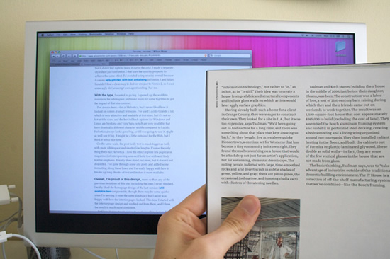
The basic idea is simple: we should have fonts at the “default” size, about 16px, no smaller. This is about the size of text in print, read at a reasonable distance (typically closer up than a screen):

Also it calls out low-contrast color schemes, which I think are mostly passe, and I will not insult you, my reader, by suggesting you don’t entirely agree. Because if you don’t agree, well, I’m afraid I’d have to use some strong words.
I think small fonts, low contrast, huge amounts of whitespace, are a side effect of the audience designers create for.
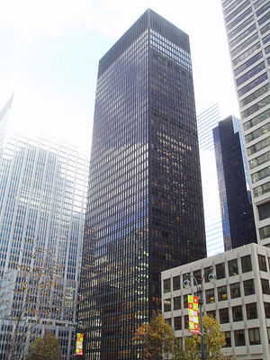
This makes me think of Modern Architecture:

This is a form of architecture popular for skyscapers and other dramatic structures, with their soaring heights and other such dramatic adjectives. These are buildings designed for someone looking at the building from five hundred feet away. They are not designed for occupants. But that’s okay, because the design isn’t sold to occupants, it is sold to people who look at the sketches and want to feel very dramatic.
Similarly, I think the design pattern of small fonts is something meant to appeal to shallow observation. By deemphasizing the text itself, the design is accentuated. Low-contrast text is even more obviously the domination of design over content. And it may very well look more professional and visually pleasing. But web design isn’t for making sites visually pleasing, it is for making the experience of the content more pleasing. Sites exist for their content, not their design.
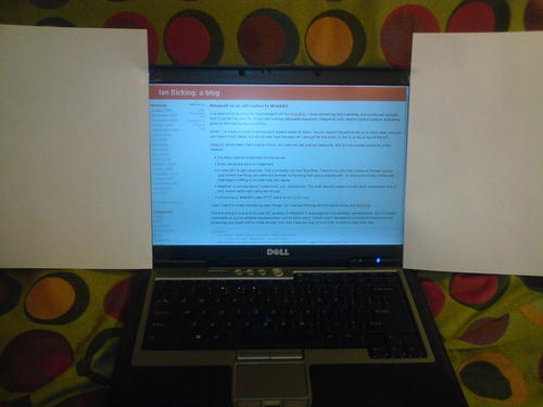
In 100e2r he also says let your text breathe. You need whitespace. If you view my site directly, you’ll notice I don’t have big white margins around my text. When you come to my site, it’s to see my words, and that’s what I’m going to give you! When I want to let my text breathe with lots of whitespace this is what I do:

Is a huge block of text hard to read? It is. And yeah, I’ve written articles like that. But the solution?
Similarly, it’s hard to read text if you don’t use paragraphs, but the solution isn’t to increase your line height until every line is like a paragraph of its own.
The solution to the drudgery of large swathes of text is:
- Make your blocks of text smaller.
- Use something other than paragraphs of text.
Throw in a list. Do some indentation. Toss in even a stupid picture. Personally I try to throw in code examples, because that’s how we roll on this blog.
That’s good writing, that’s content that is easy to read. It’s not easy to write, and I’m sure I miss the mark more often than not. But you can’t design your way to good content. If you want to write like this, if you want to let the flow of your text reflect the flow of your ideas, you need room. Huge margins don’t give you room. They are a crutch for poor writing, and not even a good crutch.
So in conclusion: modern design be damned!