I have been part of the Firefox Test Pilot team for several years. I had a long list of things I wanted to build. Some I didn’t personally want to build, but I thought they were interesting ideas. I didn’t get very far through this list at all, and now that Test Pilot is being retired I am unlikely to get to them in the future.
Given this I feel I have to move this work out of my head, and publishing a list of ideas seems like an okay way to do that. Many of these ideas were inspired by something I saw in the wild, sometimes a complete product (envy on my part!), or the seed of an idea embedded in some other product.
The experiments are a spread: some are little features that seem potentially useful. Others are features seen elsewhere that show promise from user research, but we could only ship them with confidence if we did our own analysis. Some of these are just ideas for how to explore an area more deeply, without a clear product in mind.
Test Pilot’s purpose was to find things worth shipping in the browser, which means some of these experiments aren’t novel, but there is an underlying question: would people actually use it? We can look at competitors to get ideas, but we have to ship something ourselves if we want to analyze the benefit.
Table of contents:
- Sticky Reader Mode
- Cloud Browser
- Modal Page Actions
- Find+1
- Your Front Page
- Page Archive
- Personal Historical Archive
- Navigational Breadcrumbs
- Copy Keeper
- Change Scout
- Popup Tab Switcher
- Personal Podcast
- Bookmark Manager
- Extended Library
- Text Mobile Screenshot
- Email Readable
- Your History Everywhere
- My Homepage
- Studying what Electron does for people
- App quick switcher
- Just Save
- Open Search Combined Search
- Notes Commander
- Automater
- Sidekick
- Timed Repetition
- Reader Mode improvements
- Digest Mode
- Firefox for X
- Concluding thoughts
Sticky Reader Mode
Give Reader Mode in Firefox a preference to make it per-domain sticky. E.g. if I use Reader Mode on nytimes.com and then if I visit an article on nytimes.com in the future it’ll automatically convert to reader mode. (The nytimes.com homepage would not be a candidate for that mode.)
I made an experiment in sticky-reader-mode, and I think it works really nicely. It changes the browsing experience significantly, and most importantly it doesn’t require frequent proactive engagement to change behavior. Lots of these proposed ideas are tools that require high engagement by the user, and if you don’t invoke the tool then they do nothing. In practice no one (myself included) remembers to invoke these tools. Once you click the preference on a site Sticky Reader Mode then you are opted in to this new experience with no further action required.
There are a bunch of similar add-ons. Sticky Reader Mode works a bit better than most because of its interface, and it will push you directly into Reader Mode without rendering the normal page. But it does this by using APIs that are not public to normal WebExtensions. As a result it can’t be shipped outside Test Pilot, and can’t go in addons.mozilla.org. So… just trust me, it’s great.
Recently I’ve come upon Brave Speed Reader which is similar, but without per-site opt-in, and using machine learning to identify articles.
Cloud Browser
Run a browser/user-agent in the cloud and use a mobile view as a kind of semantic or parsed view on that user agent (the phone would just control the browser that is hosted on the cloud). At its simplest we just take the page, simplify it in a few ways, and send it on - similar to what Opera Mini does. The approach lends itself to a variety of task-oriented representations of remote content.
When I first wrote this down I had just stared at my phone while it took 30 seconds to show me a 404 page. The browser probably knew after a couple seconds that it was a 404 but it acted as a rendering engine and not a user agent, so the browser insisted on faithfully rendering the useless not found page.
Obviously running a full browser instance in the cloud is resource hungry and finicky but I think we could ignore those issues while testing. Those are hard but solved operational issues.
Prior art: Opera Mini does some of this. Puffin is specifically cloud rendering for mobile. Light Point does the same for security reasons.
I later encountered brow.sh which is another interesting take on this (specifically with html.brow.sh).
This is a very big task, but I still believe there’s tremendous potential in it. Most of my concepts are not mobile-based, in part because I don’t like mobile, I don’t like myself when using a mobile device, and it’s not something I want to put my energy into. But I still like this idea.
Modal Page Actions
This was tangentially inspired by Vivaldi’s Image Properties, not because of the interface, but thinking about how to fit high-information inspection tools into the browser.
The idea: instead of context menus, page actions, or other interaction points that are part of the “chrome”, implement one overlay interface: the do-something-with-this-page interface. Might also be do-something-with-this-element (e.g. replacing the 7 image-related context menu items: View Image, Copy Image, Copy Image Location, Save Image As, Email Image, Set As Desktop Background, and View Image Info).
The interface would be an overlay onto the page, similar to what happens when you start Screenshots:
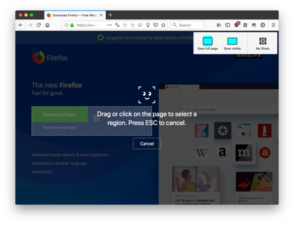
Everything that is now in the Page Action menu (the ... in the URL bar), or in the context menu, would be available here. Some items might have a richer interface, e.g., Send Tab To Device would show the devices directly instead of using a submenu. Bookmarking would include some inline UI for managing the resulting bookmark, and so on.
There was some pushback because of the line of death – that is, the idea all trusted content must clearly originate from the browser chrome, and not the content area. I do not believe in the Line of Death, it’s something users could use to form trust, but I don’t believe they do use it (further user research required).
The general pattern is inspired by mobile interfaces which are typically much more modal than desktop interfaces. Modal interfaces have gotten a bad rap, I think somewhat undeserved: modal interfaces are also interfaces that guide you through processes, or ask you to explicitly dismiss the interface. It’s not unreasonable to expect someone to finish what they start.
Find+1
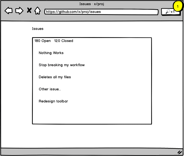
We have find-in-page but what about find-in-anything-linked-from-this-page?
Hit Cmd-Shift-F and you get an interface to do that. All the linked pages will be loaded in the background and as you search we show snippets of matching pages. Clicking on a snippet opens or focuses the tab and goes to where the search term was found.
I started experimenting in find-plus-one and encountered some challenges: hidden tabs aren’t good workers, loading pages in the background takes a lot of grinding in Firefox, and most links on pages are stupid (e.g., I don’t want to search your Careers page). An important building block would be a way to identify the important (non-navigational) parts of a page. Maybe lighter-weight ways to load pages (in other projects I’ve used CSP injection). The Copy Keeper concept did come about while I experimented with this.
A simpler implementation of this might simply do a text search of all your open tabs, which would be technically simpler and mostly an exercise in making a good representation of the results.
Your Front Page
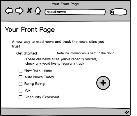
Create a front page of news from the sites you already visit. Like an RSS reader, but prepopulated with your history. This creates an immediate well-populated experience.
My initial thought was to use ad hoc parsers for popular news sites, and at run an experiment with just a long whitelist of news providers.
I got the feedback: why not just use RSS? Good question: I thought RSS was kind of passé, but I hadn’t looked for myself. I went on to do some analysis of RSS, and found it available for almost all news sites. The autodetection (<link rel=alternate>) is not as widely available, and it requires manual searching to find many feeds. Still RSS is a good way to get an up-to-date list of articles and their titles. Article content isn’t well represented and other article metadata is inaccurate or malformed (e.g., there are no useful tags). So using RSS would be very reasonable discovery mechanism, but an “RSS reader” doesn’t seem like a good direction on the current web.
Page Archive
This is bringing back old functionality from Page Shot, a project of mine which morphed into Firefox Screenshots: save full DOM copies of pages. What used to be fairly novel is now well represented by several projects (e.g., WebMemex or World Brain Memex).
Unfortunately I have never been able to really make this kind of tool part of my own day-to-day behavior, and I’ve become skeptical it can work for a general populace. But maybe there’s a way to package up this functionality that is more accessible, or happens more implicitly. I forked a version of Page Shot as pagearchive a while ago, with this in mind, but I haven’t (and likely won’t) come back to it.
Personal Historical Archive
This isn’t really a product idea, but instead an approach to developing products.
One can imagine many tools that directly interact or learn from the content of your browsing. There is both a privacy issue here and a privacy opportunity: looking at this data is creepy, but if the tools live in your user agent (that belongs to you and hosts your information locally) then it’s not so creepy.
But it’s really hard to make experiments on this because you need a bunch of data. If you build a tool that starts watching your browsing then it will only slowly build up interesting information. The actual information that is already saved in browser history is interesting, but in my experience it is too limited and of poor quality. For instance, it is quite hard to build up a navigational path from the history when you use multiple tabs.
A better iterative development approach would be one where you have a static set of all the information you might want, and you can apply tools to that information. If you find something good then later you can add new data collection to the browser, secure in the knowledge that it’s going to find interesting things.
I spent quite a bit of effort on this, and produced `personal-history-archive. It’s something I still want to come back to. It’s a bit of a mess, because at various times it was retrofitted to collect historical information, or collect it on an ongoing basis, or collected it when driven by a script. I also tried to build tools in parallel for doing analysis on the resulting database.
This is also a byproduct of experimentation with machine learning. I wanted to apply things I was learning to browser data, but the data I wanted wasn’t there. I spent all my time collecting and cleaning data, and ended up spending only a small amount of time analyzing the data. I suspect I’m not the only one who has done this.
Navigational Breadcrumbs
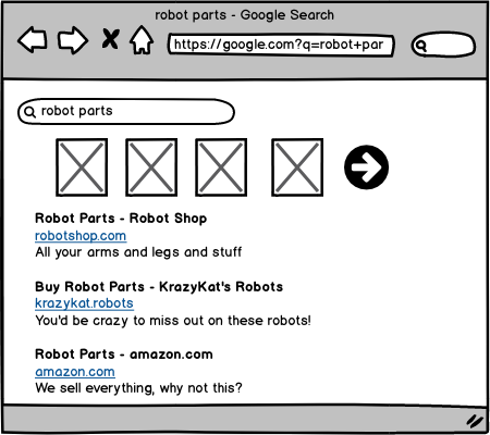
When I click on a link I lose the reminder of why I clicked on it. What on the previous page led me to click on this? Was I promised something? Are there sibling links that I might want to continue to directly instead of going back and selecting another link?
This tool would give you additional information about the page you are on, how you got there, and given where you came from, where you might go next. Would this be a sidebar? Overlay content? In a popup? I’m not sure.
Example: using this, if I click on a link from Reddit I will be able to see the title of the Reddit post (which usually doesn’t match the document title), and a link to comments on the page. If I follow a link from Twitter, I’ll be able to see the Tweet I came from.
This could be interesting paired with link preview (like a tentative forward). Maybe the mobile browser Linkbubbles (now integrated into Brave) has some ideas to offer.
Technically this will use some of the techniques from Personal History Archive, which tracks link sources.
This is based on the train of thought I wrote down in an HN comment – itself a response to Freeing the Web from the Browser.
I want to try this still, and have started a repo crossnav but haven’t put anything there yet. I think even some naive approaches could work, just trying to detect the category of link and the related links (e.g., on Reddit the category is other submissions, and the related links are things like comments).
Copy Keeper
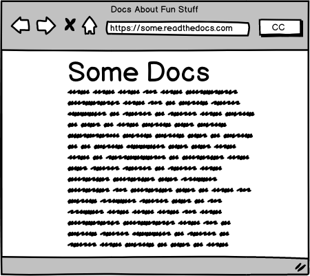
A notebook/logbook that is filled in every time you copy from a web page. When you copy it records (locally):
- Text of selection
- HTML of selection
- Screenshot of the block element around the selection
- Text around selection
- Page URL and nearest anchor/id
- Page title
- Datetime
This overloads “copy” to mean “remember”.
Clips would be searchable, and could be moved back to the clipboard in different forms (text, HTML, image, bibliographical reference, source URL). Maybe clips would be browsable in a sidebar (maybe the sidebar has to be open for copies to be collected), or clips could be browsed in a normal tab (Library-style).
I created a prototype in copy-keeper. I thought it was interesting and usable, though whether it would actually get any use in practice I don’t know. It’s one of those tools that seems handy but requires effort, and as a result doesn’t get used.
Change Scout
(Wherein I both steal a name from another team, and turn it into a category…)
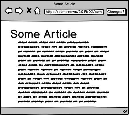
Change Scout will monitor a page for you, and notify you when it changes. Did someone edit the document? Was there activity on an issue? Did an article get updated? Put Change Scout to track it and it will tell you what changes and when.
It would monitor the page inside the browser, so it would have access to personalized and authenticated content. A key task would be finding ways to present changes in an interesting and compact way. In another experiment I tried some very simple change detection tools, and mostly end up frustrated (small changes look very large to naive algorithms).
Popup Tab Switcher
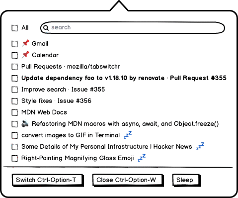
We take the exact UI of the Side View popup, but make it a tab switcher. “Recent Tabs” are the most recently focused tabs (weighted somewhat by how long you were on the tab), and then there’s the complete scrollable list. Clicking on an item simply focuses that tab. You can close tabs without focusing them.
I made a prototype in tab-switchr. In it I also added some controls to close tabs, which was very useful for my periodic tab cleanups. Given that it was a proactive tool, I surprised myself by using it frequently. There’s work in Firefox to improve this, unrelated to anything I’ve done. It reminds me a bit of various Tree-Style Tabs, which I both like because they make it easier to see my tabs, and dislike because I ultimately am settled on normal top-tabs. The popup interface is less radical but still provides many of the benefits.
I should probably clean this up a little and publish it.
Personal Podcast
Create your own RSS feed.
- When you are on a page with some audio source, you can add the audio to your personal feed
- When on an article, you can generate an audio version that will be added to the feed
- You get an RSS feed with a random token to make it private (I don’t think podcast apps handle authentication well, but this requires research)
- Maybe you can just send/text the link to add it to your preferred podcast app
- If apps don’t accept RSS links very well, maybe something more complicated would be required. An app that just installs an RSS feed? We want to avoid the feed accidentally ending up in podcast directories.
Bookmark Manager
There’s a lot of low-rated bookmark managers in addons.mozilla.org and the Chrome Extension store. Let’s make our own low-rated bookmark manager!
But seriously, this would anticipate updates to the Library and built-in bookmark manager, which are deficient.
Some resources/ideas: * Comment with a few gripes * Google’s bookmark manager * Bookmark section on addons.mozilla.org * Bookmark organizers on addons.mozilla.org * Relevant WebExtension APIs
Extended Library
The “Library” in Firefox is the combination history and bookmark browser you get if you use “Show all bookmarks” or “Show all history”.
In this idea we present the user with a record of their assets, wherever they are.
This is like a history view (and would be built from history), but would use heuristics to pick out certain kinds of things: docs you’ve edited, screenshots you’ve taken, tickets you’ve opened, etc. We’d be trying hard to find long-lived documents in your history, instead of transitional navigation, articles, things you’ve gotten to from public indexes, etc.
Automatically determining what should be tagged as a “library item” would be the hard part. But I think having an organic view of these items, regardless of underlying service, would be quite valuable. The browser has access to all your services, and it’s easy to forget what service hosts the thing you are thinking about.
Text Mobile Screenshot
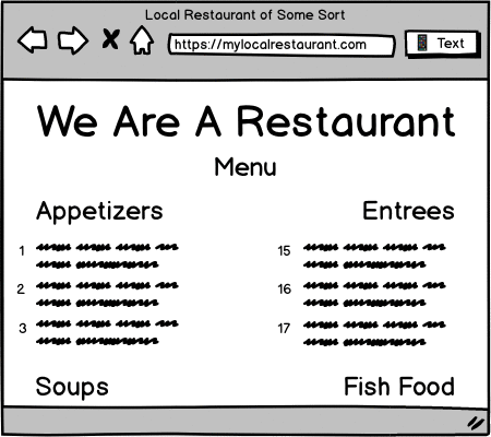
This tool will render the tab in a mobile factor (using the devtools responsive design mode), take a full-page screenshot, and text the image and URL to a given number. Probably it would only support texting to yourself.
I’ve looked into this some, and getting the mobile view of a page is not entirely obvious and requires digging around deep in the browser. Devtools does some complicated stuff to display the mobile view. The rest is basic UI flows and operational support.
Email Readable
Emails the Reader Mode version of a site to yourself. In our research, people love to store things in Email, so why not?
Though it lacks the simplicity of this concept, Email Tabs contains this basic functionality. Email This does almost exactly this.
Your History Everywhere
An extension that finds and syncs your history between browsers (particularly between Chrome and Firefox).
This would use the history WebExtension APIs. Maybe we could create a Firefox Sync client in Chrome. Maybe it could be a general way to move things between browsers. Actual synchronization is hard, but creating read-only views into the data in another browser profile is much easier.
Obviously there’s lots of work to synchronize this data between Firefox properties, and knowing the work involved this isn’t easy and often involves close work with the underlying platform. Without full access to the platform (like on Chrome) we’ll have to find ways to simplify the problem in order to make it feasible.
My Homepage
Everyone (with an FxA account) gets there own homepage on the web. It’s like Geocities! Or maybe closer to github.io.
But more seriously, it would be programmatically accessible simple static hosting. Not just for you to write your own homepage, but an open way for applications to publish user content, without those applications themselves turning into hosting platforms. We’d absorb all the annoyances of hosting content (abuse, copyright, quotas, ops, financing) and let open source developers focus on enabling interesting content generation experiences for users on the open web.
Here’s a general argument why I think this would be a useful thing for us to do. And another from Les Orchard.
Studying what Electron does for people
This is a proposal for user research:
Electron apps are being shipped for many services, including services that don’t require any special system integration. E.g., Slack doesn’t require anything that a web browser can’t do. Spotify maybe catches some play/pause keys, but is very close to being a web site. Yet there is perceived value in having an app.
The user research would focus on cases where the Electron app doesn’t have any/many special permissions. What gives the app value over the web page?
The goal would be to understand the motivations and constraints of users, so we could consider ways to make the in-browser experience equally pleasant to the Electron app.
App quick switcher
Per my previous item: why do I have an IRCCloud app? Why do people use Slack apps? Maybe it’s just because they want to be able to switch into and out of those apps quickly.
A proposed product solution: add a shortcut to any specific (pinned?) tab. Might be autocreated. Using the shortcut when the app is already selected will switch you back to your previous-selected tab. Switching to the tab without the shortcut will display a gentle reminder that the shortcut exists (so you can train yourself to start using it).
To make it a little more fancy, I thought we might also be able to do a second related “preview” shortcut. This would let you peek into the window. I’m not sure what “peeking” means. Maybe we just show a popup with a screenshot of that other window.
Maybe this should all just overload ⌘1/2/3 (maybe shift-⌘1/etc for peeking). Note these shortcuts do not currently have memory – you can switch to the first tab with ⌘1, but you can’t switch back.
This is one suggested solution to Whatever Electron does for people.
I started some work in quick-switch-extension, but keyboard shortcuts were a bit wonky, and I couldn’t figure out useful additional functionality that would make it fun. Firefox (Nightly?) now has Ctrl-Tab functionality that takes you to recent tabs, mitigating this problem (though it is not nearly as predictable as what I propose here).
Just Save
Just Save saves a page. It’s like a bookmark. Or a remembering. Or an archive. Or all of those all at once.
Just Save is a one-click operation, though a popup does show up (similar in function to Pocket) that would allow some additional annotation of your saved page.
We save: 1. Link 2. Title 3. Standard metadata 4. Screenshot 5. Frozen version of page 6. Scroll position 7. The tab history 8. Remember the other open tabs, so if some of them are saved we offer later relations between them 9. Time the page was saved 10. Query terms that led to the page
It’s like bookmarks, but purely focused on saving, while bookmarks do double-duty as a navigational tool. The tool encourages after-the-fact discovery and organization, not at-the-time-of-save choices.
And of course there’s a way to find and manage your saved pages. This idea needs more exploration of why you would return to a page or piece of information, and thus what we’d want to expose and surface from your history. We’ve done research, but it’s really just a start.
Open Search Combined Search
We have several open search providers. How many exist out there? How many could we find in history?
In theory Open Search is an API where a user could do personalized search across many properties, though I’m not sure if any sufficient number of sites has enabled it.
Notes Commander
It’s Notes, but with slash commands.
I other words it’s a document, but if you complete a line that begins with a / then it will try to execute that command, appending or overwriting from that point.
So for instance /timestamp just replaces itself with a timestamp.
Maybe /page inserts the currently active tab. /search foo puts search results into the document, but as editable (and followable) links. /page save freezes the page as one big data link, and inserts that link into the note.
It’s a little like Slack, but in document form, and with the browser as the context instead of a messaging platform. It’s a little like a notebook programming interface, but less structured and more document-like.
The ability to edit the output of commands is particularly interesting to me, and represents the kind of ad hoc information organizing that we all do regularly.
I experimented some with this in Notes, and got it working a little bit, but working with CKEditor (that Notes is built on) was just awful and I couldn’t get anything to work well. Notes also has a very limited set of supported content (no images or links), which was problematic. Maybe it’s worth doing it from scratch (with ProseMirror or Slate?)
After I tried to mock this up, I realized that the underlying model is much too unclear in my mind. What’s this for? When is it for? What would a list of commands look like?
Another thing I realized while attempting a mockup is that there should be a rich but normalized way to represent pages and URLs and so forth. Often you’ll be referring to URLs of pages that are already open. You may want to open sets of pages, or see immediately which URLs are already open in a tab. A frozen version of a page should be clearly linked to the source of that page, which of course could be an open tab. There’s a lot of pieces to fit together here, both common nouns and verbs, all of which interact with the browser session itself.
Automater
Automation and scripting for your browser: make demonstrations for your browser, give it a name, and you have a repeatable script.
The scripts will happen in the browser itself, not via any backend or scraping tool. In case of failed expectations or changed sites, the script will halt and tell the user.
Scripts could be as simple as “open a new tab pointing to this page every weekday at 9am”, or could involve clipping information, or just doing a navigational pattern before presenting the page to a user.
There’s a huge amount of previous work in this area. I think the challenge here is to create something that doesn’t look like a programming language displayed in a table.
Sidekick
Sidekick is a sidebar interface to anything, or everything, contextually. Some things it might display:
- Show you the state of your clipboard
- Show you how you got to the current tab (similar to Navigational Breadcrumbs)
- Show you other items from the search query that kicked off the current tab
- Give quick navigation to nearby pages, given the referring page (e.g., the next link, or next set of links)
- Show you buttons to activate other tabs you are likely to switch to from the current tab
- Show shopping recommendations or other content-aware widgets
- Let you save little tidbits (text, links, etc), like an extended clipboard or notepad
- Show notifications you’ve recently received
- Peek into other tabs, or load them inline somewhat like Side View
- Checklists and todos
- Copy a bunch of links into the sidebar, then treat them like a todo/queue
Possibly it could be treated like an extensible widget holder.
From another perspective: this is like a continuous contextual feature recommender. I.e., it would try to answer the question: what’s the feature you could use right now?
Timed Repetition
Generally in order to commit something to long-term memory you must revisit information later, ideally long enough that it’s a struggle.
Is anything we see in a browser worth committing to long-term memory? Sometimes it feels like nothing is worth remembering, but that’s a kind of nihilism based on the shitty aspects of typical web browsing behavior.
The interface would require some positive assertion: I want to know this. Probably you’d want to highlight the thing you’d “know”. Then, later, we’d want to come up with some challenge. We don’t need a “real” test that is verified by the browser, instead we simply need to ask some related question, then the user can say if they got it right or not (or remembered it or not).
- More information on the general technique in the Spaced Repetition Wikipedia article.
- Incremental Reading is an approach to information consumption paired with flashcard review.
- Anki is the most prominent open source software in this area. Oddly while there is a lot of WebExtension-based intake software for it, the actual testing is primarily done in a native app.
- A bizarre hard-to-read font meant to aid in memory.
Reader Mode improvements
Reader mode is a bit spartan. Maybe it could be a bit nicer:
- Pick up some styles or backgrounds from the hosting site
- Display images or other media differently or more prominently
- Add back some markup or layout that Readability erases
- Apply to some other kinds of sites that aren’t articles (e.g., a video site)
- A multicolumn version like McReadability
Digest Mode
Inspired by Full Hacker News (comments): take a bunch of links (typically articles) and concatenate their content into one page.
Implicitly this requires Reader Mode parsing of the pages, though that is relatively cheap for “normal” articles. Acquiring a list of pages is somewhat less clear. Getting a list of pages is a kind of news/RSS question. Taking a page like Hacker News and figuring out what the “real” links are is another approach that may be interesting. Lists of related links are everywhere, yet hard to formally define.
This would work very nicely with complementary text summarization.
Open question: is this actually an interesting or useful way to consume information?
Firefox for X
There’s an underlying concept here worth explaining:
Feature develop receives a lot of skepticism. And it’s reasonable: there’s a lot of conceit in a feature, especially embedded in a large product. Are people going to use a product or not because of some little feature? Or maybe the larger challenge: can some feature actually change behavior? Every person has their own thing going on, people aren’t interested in our theories, and really not that many people are interested in browsers. Familiar functionality – the back button, bookmarks, the URL bar, etc. – are what they expect, what they came for, and what they will gravitate to. Everything I’ve written so far in this list are things people won’t actually use.
A browser is particularly problematic because it’s so universal. It’s for sites and apps and articles. It’s for the young and the elderly, the experienced and not. It’s used for serious things, it’s used for concentration, and it’s used for dumb things and to avoid concentrating. How can you build a feature for everyone, targeting anything they might do? And if you build something, how can a person trust a new feature is really for them, not some other person? People are right to be skeptical of the new!
But we also know that most people regularly use more than one browser. Some people use Chrome for personal stuff, and Firefox for work. Some people do the exact opposite. Some people do their banking and finance in a specific browser. Some use a specific browser just for watching videos.
Which browser a person uses for which task is seemingly random. Maybe they were told to use a specific browser for one task, and then the other browser became the fallback. Maybe they once heard somewhere once that one browser was more secure. Maybe flash seemed broken on one browser when they were watching a video, and now a pattern has been set.
This has long seemed like an opportunity to me. Market a browser that actually claims to be the right browser for some of these purposes! Firefox has Developer Edition and it’s been reasonably successful.
This offers an opportunity for both Mozilla and Firefox users to agree on purpose. What is Firefox for? Everything! Is this feature meant for you? Unlikely! In a purpose-built browser both sides can agree what it’s trying to accomplish.
This idea often gets poo-pooed for how much work it is, but I think it’s simpler than it seems. Here’s what a “new browser” means:
- Something you can find and download from its own page or site
- It’s Firefox, but uses its own profile, keeping history/etc separate from other browser instances (including Firefox)
- It has its own name and icon, and probably a theme to make it obvious what browser you are in
- It comes with some browser extensions and prefs changed, making it more appropriate for the proposed use case
The approach is heavy on marketing and build tools, and light on actual browser engineering.
I also have gotten frequent feedback that Multi-Account Containers should solve all these use cases, but that gets everything backwards. People already understand multiple browsers, and having completely new entry points to bring people to Firefox is a feature, not a bug.
Sadly I think the time for this has passed, maybe in the market generally or maybe just for Mozilla. It would have been a very different approach to the browser.
Some of us in the Test Pilot team had some good brainstorming around actual concepts too, which is where I actually get excited about the ideas:
Firefox Study
For students, studying.
- Integrate note-taking tools
- Create project and class-based organizational tools, helping to organize tabs, bookmarks, and notes
- Tools to document and organize deadlines
- Citation generators
I don’t know what to do with online lectures and video, but it feels like there’s some meaningful improvements to be done in that space. Video-position-aware notetaking tools?
I think the intentionality of opening a browser to study is a good thing. iPads are somewhat popular in education, and I suspect part of that is having a device that isn’t built around multitasking, and using an iPad means stepping away from regular computing.
Firefox Media
To watch videos. This requires very few features, but benefits from just being a separate profile, history, and icon.
There’s a small number of features that might be useful:
- Cross-service search (like Can I Stream.it or JustWatch)
- Search defaults to video search
- Cross-service queue
- Quick service-based navigation
I realize it’s a lot like Roku in an app.
Firefox for Finance
This is really just about security.
Funny story: people say they value security very highly. But if Mozilla wants to make changes in Firefox that increase security but break some sites – particularly insecure sites – people will then stop using Firefox. They value security highly, but still just below anything at all breaking. This is very frustrating for us.
At the same time, I kind of get it. I’m dorking around on the web and I click through to some dumb site, and I get a big ol’ warning or a blank page or some other weirdness. I didn’t even care about the page or its security, and here my browser is trying to make me care.
That’s true some of the time, but not others. If you are using Firefox for Finance, or Firefox Super Secure, or whatever we might call it, then you really do care.
There’s a second kind of security implied here as well: security from snooping eyes and on shared computers. Firefox Master Password is a useful feature here. Generally there’s an opportunity for secure data at rest.
This is also a vehicle for education in computer security, with an audience that we know is interested.
Firefox Low Bandwidth
Maybe we work with proxy services. Or just do lots of content blocking. In this browser we let content break (and give a control to load the full content), so long as you start out compact.
- Cache content that isn’t really supposed to be cached
- Don’t load some kinds of content
- Block fonts and other seemingly-unimportant content
- Monitoring tools to see where bandwidth usage is going
Firefox for Kids
Sadly making things for kids is hard, because you are obliged to do all sorts of things if you claim to target children, but you don’t have to do anything if kids just happen to use your tool.
There is an industry of tools in this area that I don’t fully understand, and I’d want to research before thinking about a feature list. But it seems like it comes down to three things:
- Blocking problematic content
- Encouraging positive content
- Monitoring tools for parents
There’s something very uninspiring about that list, it feels like it’s long on negativity and short on positive engagement. Coming up with an answer to that is not a simple task.
Firefox Calm
Inspired by a bunch of things:
What would a calm Firefox experience look like? Or maybe it would be better to think about a calm presentation of the web. At some point I wrote out some short pitches:
- Read without distraction: Read articles like they are articles, not interactive (and manipulative) experiences.
- Stay focused on one thing at a time: Instead of a giant list of tabs and alerts telling you what we aren’t doing, automatically focus on the one thing you are doing right now.
- Control your notifications: Instead of letting any site poke at you for any reason, notifications are kept to a minimum and batched.
- Focused writing: When you need to focus on what you are saying, not what people are saying to you, enter focused writing mode.
- Get updates without falling down a news hole: Avoid clickbait, don’t reload pages, just see updates from the sites you trust (relates to Your Front Page)
- Pomodoro: let yourself get distracted… but only a little bit. The Pomodoro technique helps you switch between periods of focused work and letting yourself relax
- Don’t even ask: Do you want notifications from the news site you visited once? Do you want videos to autoplay? Of course not, and we’ll stop even asking.
- Suggestion-free browsing: Every page you look at isn’t an invitation to tell you what you should look at next. Remove suggested content, and do what YOU want to do next. (YouTube example)
Concluding thoughts
Not just the conclusion of this list, the conclusion of my work in this area…
Some challenges in the design process:
- Asking someone to do something new is hard, and unlikely to happen. My previous post (The Over-engaged Knowledge Worker) relates to this tension.
- … and yet a “problem” isn’t enough to get someone to do something either.
- If someone is consciously and specifically doing some task, then there’s an opportunity.
- Creating wholistic solutions is unwelcome, unintuitively each thing that adds to the size of a solution diminishes from the breadth of problems the solution can solve.
- … and yet, abstract solutions without any clear suggestion of what they solve aren’t great either!
- Figuring out how to package functionality is a big deal.
- Approaches that increase the density of information or choices are themselves somewhat burdensome.
- … and yet context-sensitive approaches are unpredictable and distracting compared to consistent (if dense) functionality.
- I still believe there’s a wealth of material in the content of the pages people encounter. But it’s irregular and hard to understand, it takes concerted and long-term effort to do something here.
- Lots of the easy stuff, the roads well traveled, are still hard for a lot of people. Maybe this can be fixed by optimizing current UI… but I think there’s still room for novel improvements to old ideas.
- User research is a really great place to start, but it’s not very prescriptive. It’s mostly problem-finding, not solution-finding.
- There’s some kinds of user research I wish I had access to, specifically really low level analysis of behavior. What’s in someone’s mind when they open a new tab, or reuse one? In what order do they scan the UI? What are mental models of a URL, of pages and how they change, in what order to people compose (mentally and physically) things they want to share… it feels like it can go on forever, and there would be a ton of detail in the results, but given all the other constraints these insights feel important.
- There’s so many variables in an experiment, that it’s hard to know what failures really means. Every experiment that offers a novel experience involves several choices, and any one choice can cause the experiment to fail.
As Test Pilot comes to an end, I do find myself asking: is there room for qualitative improvements in desktop browser UI? Desktop computing is waning. User expectations of a browser are calcified. The only time people make a choice is when something breaks, and the only way to win is to not break anything and hope you competitor does break things.
So, is there room for improvement? Of course there is! The millions of hours spent every day in Firefox alone… this is actually important. Yes, a lot of things are at a local maximum, and we can A/B test little tweaks to get some suboptimal parts to their local maximum. But I do not believe in any way that the browsers we know are the optimal container. The web is bigger than browsers, bigger than desktop or mobile or VR, and a user agent can do unique things beyond any site or app.
And yet…
Hack News Comments if that’s your thing.
Comments
Hey. Read your comment about spaced repetition and incremental reading.
You should try Polar... it's RIGHT up your alley. Implements both and has Anki sync for your flashcards.
It's a long term personal knowledge repository for your documents. It's based on Electron and super hackable if you're interested.
https://getpolarized.io/
I'll also hook you up with a premium account if you email me so you can get more cloud storage.
With regards to "whatever people get from Electron", it's app-like behavior. It's in my app launcher / start menu / desktop. It has its own window, and isn't shared with other browser tabs. I can use OS-specific shortcuts to launch, switch to, and close it.
And, secondarily, native integration into the OS is nice, too. (Example: An HTML5 audio app displays audio controls on the phone's lockscreen.)
I believe progressive web apps (PWAs) are the way forward for app-like behavior.
This this this. I don't want to use cmd-1, cmd-2, etc or ctrl-tab to switch to an app in a browser tab. I want to use cmd-tab to switch to an application.
Chrome's "Create Shortcut" feature is 90% of the way there, but the "apps" it creates have unusual cmd-tab behavior on macOS, so I'm stuck with Electron apps.
Also, websites/webapps in the browser, are transient. As in, I only sometimes want to go to them. Even pinned tabs eventually get closed. An app, like Slack, is something that I want to keep open and not connected to my browser.
There's also a local vs. remote aspect. I expect an app to store things on my device and not to upload things to the web. If I open a webapp in a browser, then I expect it to upload my data to the web. Even if the app supposedly only uses local storage.
Electron also adds in the ability to code parts of an app in C/C++/etc when Javascript just can't give the performance that is needed.
I haven't gotten very far learning Electron yet, but one interesting thing is that you can disable remote scripts entirely in an Electron app. You can't do that in a webapp.
All that said, I do wish Mozilla would release a competitor to Electron. The web is way to dependent on libchromium for comfort right now.
+1 for the Gecko based Electron competitor, maybe Positron will come back some day!? https://github.com/mozilla/...
I have been working on the timed repetition one for the past couple of years.
https://vocabifyapp.com
It's a Chrome extension & web app for highlighting bits you read online. Then it generates flashcards for you to review on a spaced repetition-type schedule. No Firefox extension yet, but shouldn't be hard to port over.
Really impressed with the other experiment proposals! Some really cool ideas.
"Just Save" looks like something I've been interested in for some time. I do a lot of stashing of copies of things on disk, but the "File-Save As" dialog is really clunky (and recently has gotten worse on linux-- thanks libgtk) and just using the <title> to get a default file name is pretty weak.
I remember Sidekick :)
https://en.wikipedia.org/wi...
Hi Ian, we're developing a similar cross platform search similar to the two you have posted above called SpeedyTV.com . Its in the early stages but we're seeing quite a few folks find it useful as we gain feedback from our users.